Palette Adjustment
The purpose of palette adjustment is to maximize the contrast and detail in the final mosaic.
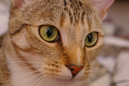
Original Image:
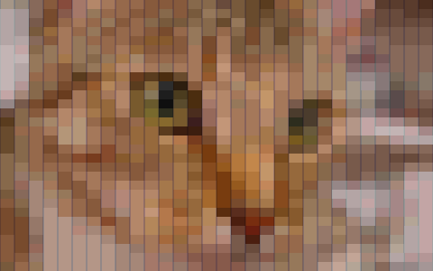
Mosaic without Palette Adjustment:
Mosaic with Palette Adjustment:
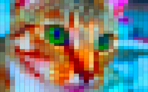
The mosaic of the unadjusted image is truer to the original colors, but the adjusted image achieves higher detail. The boost in details is especially important when the color palette of the tile pool lacks variety or does not overlap well with the color palette of the original image.
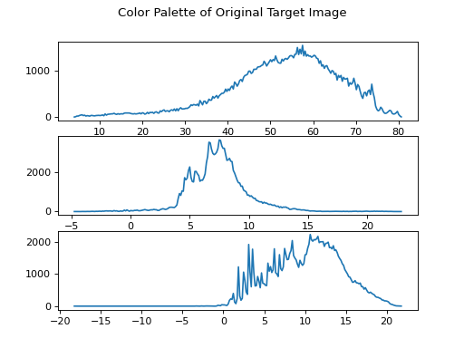
To visualize color palette, we’ll look at histograms of the values in each color channel.
This is the palette of the original image.
converted_img = pm.perceptual(image)  # use the perceptually-uniform space
pm.plot_palette(pm.color_palette(converted_img))
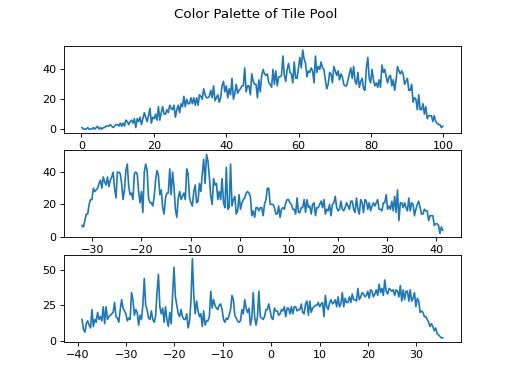
Contrast this with the color palette of the candidate images in the pool, below. The palette of the pool is broader (particularly in the second and third channels) because there is a greater variety of colors in the pool than in the original image. In a mosaic, many of the pool images would not be used, while others would need to be reused many times over. This results in lower contrast.
pm.plot_palette(pm.color_palette(list(pool.values())))
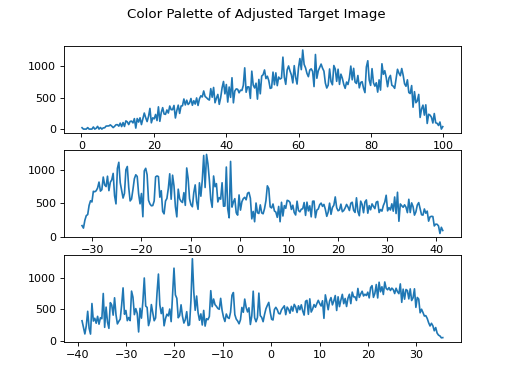
The function adapt_to_pool() distorts the colors of the original
image so that it has a color palette similar to the pool. Notice that the
envelopes of the histograms below match those above.
adjusted_img = pm.adapt_to_pool(converted_img, pool)
pm.plot_palette(pm.color_palette(adjusted_img))
The adjusted image looks like this.
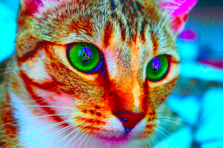
Of course, if we use a different pool — say, one with sepia toned images — we’d get a different adjusted image tuned to the color palette of that pool.